





Building clarity and
trust during a housing merger.
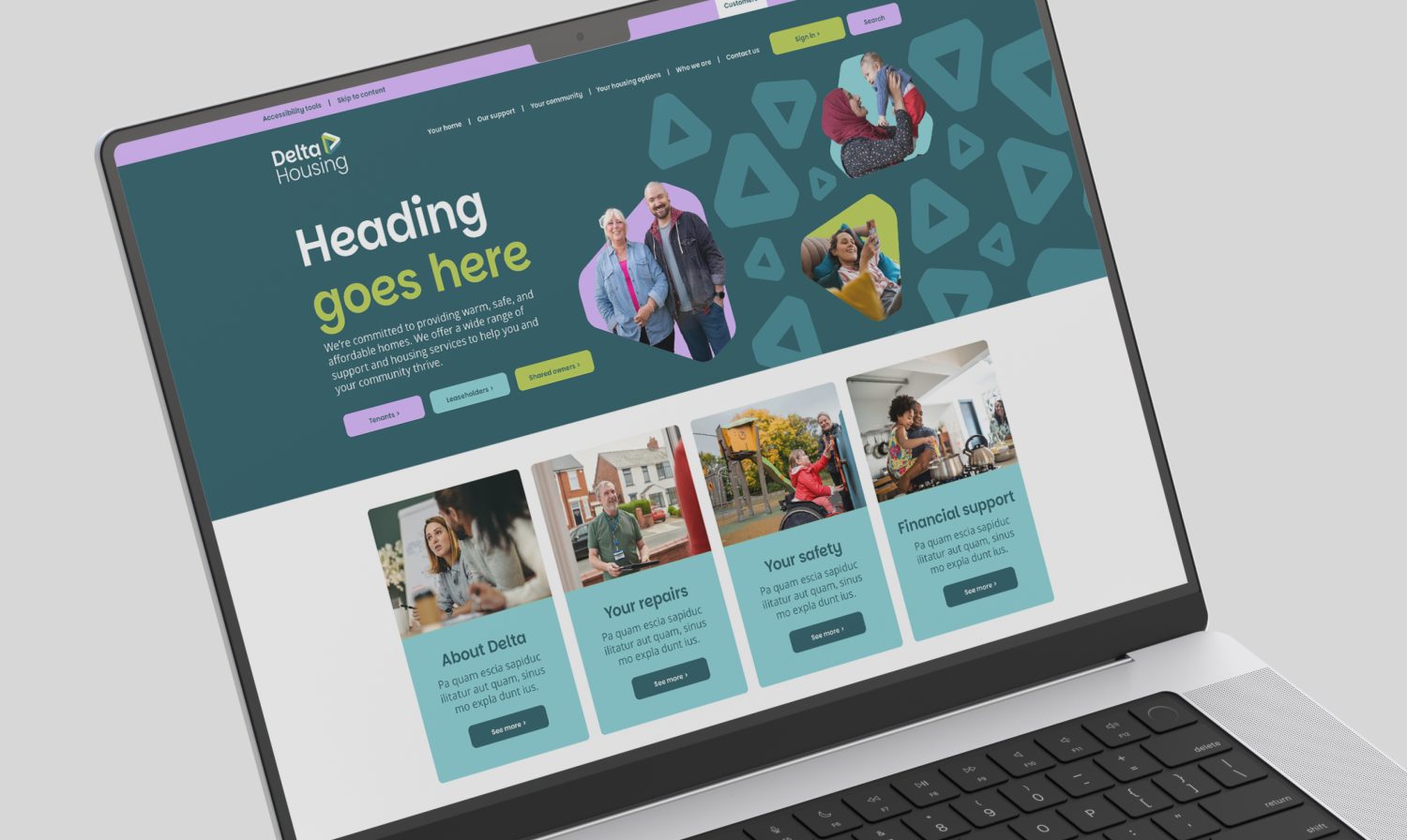
A unifying housing brand for Delta Housing, created to build trust quickly following the merger of CHP and Estuary. Insight-led and flexible, it works seamlessly across touchpoints while engaging colleagues and tenants from day one.
The brief (in brief)
When CHP and Estuary came together to form Delta Housing, the largest housing association in Essex with a 17,000 home portfolio, the real challenge wasn’t choosing a name or designing a logo, it was earning trust during a moment of change. CHP and Estuary’s tenants wanted to know standards wouldn’t slip, whilst staff of both housing associations needed something to unite behind. Our challenge was to create a brand to bring clarity quickly, and that worked from day one, across every touchpoint.
Our approach
We started by listening, through hands on workshops with staff, stakeholders and tenants. That enabled us to focus on what people needed from Delta Housing and what they didn’t. We used these insights to shape our work from day one.
Stakeholders didn’t want to simply blend two brands together and play it safe, so we needed to create something clear, confident and engaged colleagues and tenants.
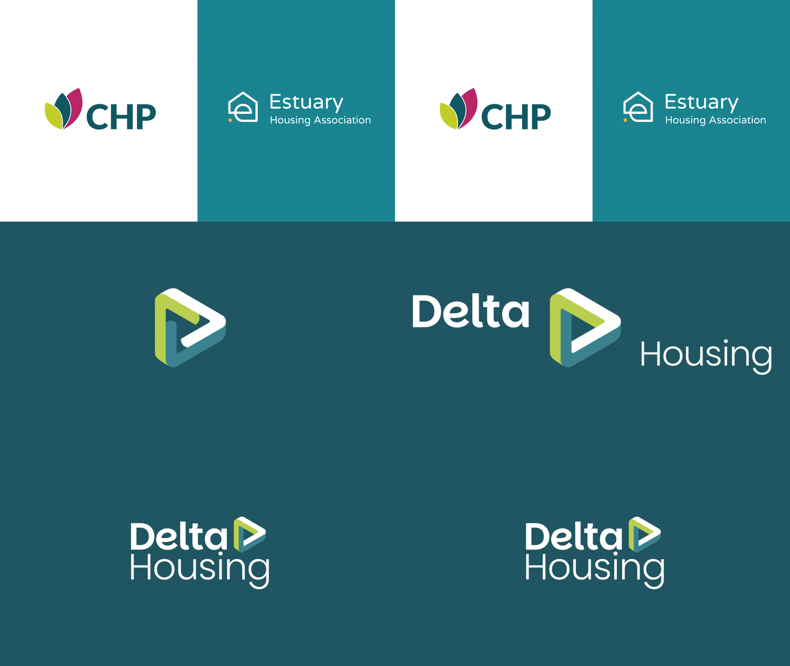
The result is a bold, practical identity. The interlocking ‘D’ symbolises the unity of CHP and Estuary, along with their customers. The triangle is not only a nod to the Greek delta (Δ), but also signals purpose, balanced by a solid, dependable form.
Some familiar colours were carried forward from both organisations to keep trust and recognition intact, tweaked slightly for greater WCAG 2.2 compliance.

The important stuff
Delta Housing needed a brand that could flex with context and communication channel.
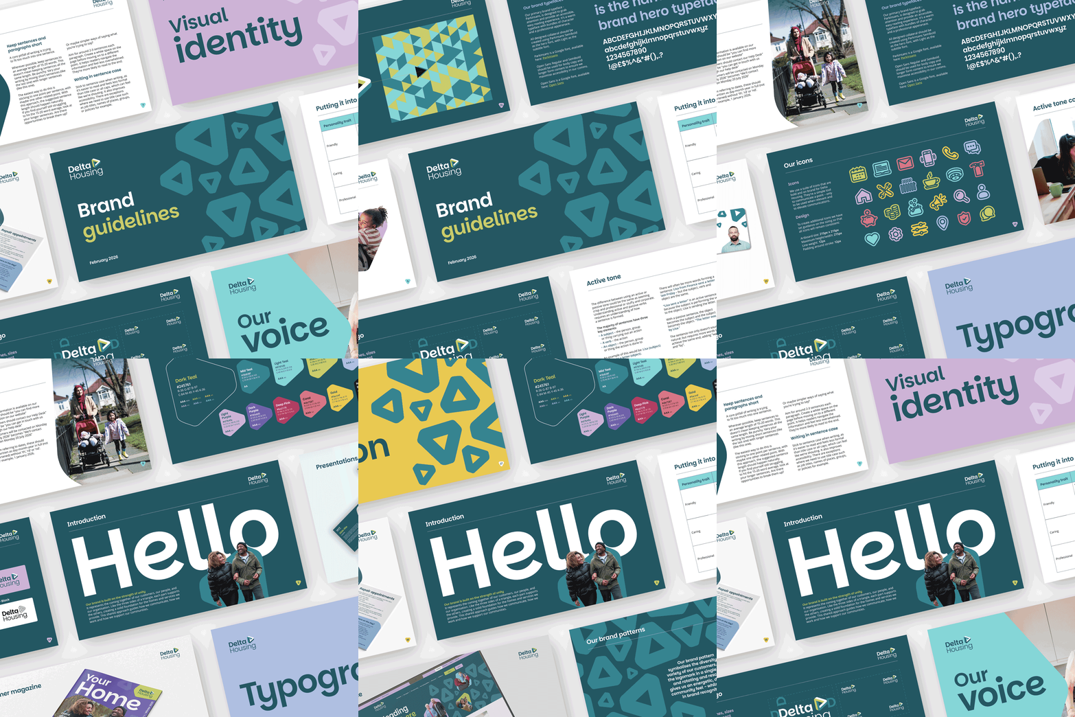
We developed a personality scale, a simple framework that allows tone and visual expression to shift depending on the message. More formal communications are clear, calm and professional, while customer-facing content becomes more open, engaging and expressive.
To support this, we created a versatile colour palette and a suite of graphic assets, including a range of patterns that work across the full spectrum. This ensures the brand stays consistent while adapting effectively to different audiences, needs and format.
employees consulted through research, creative validation and rollout discussions
customers engaged throughout the branding process
colleagues involved in a core group to support the brand development and creative validation
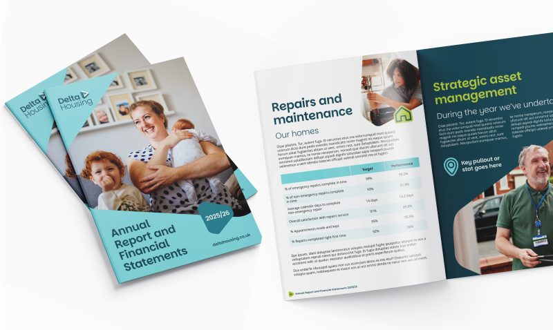
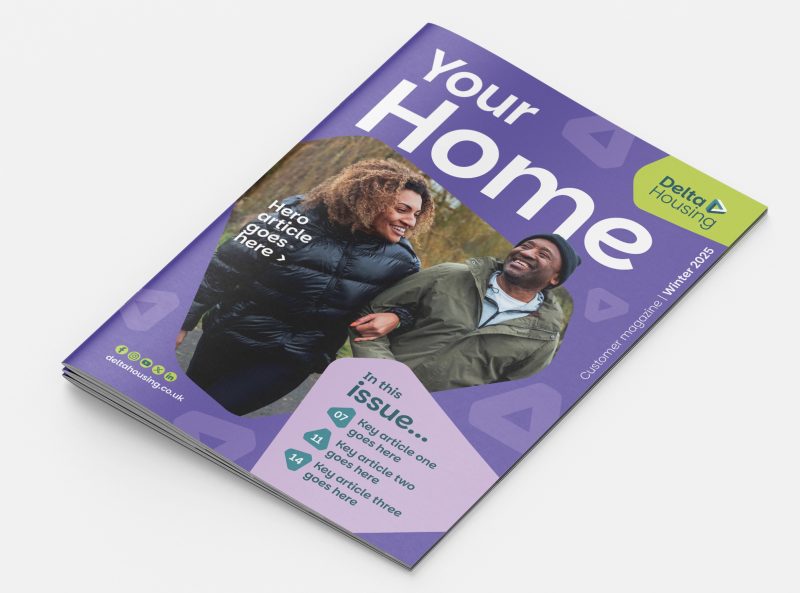
The response to the launch was overwhelmingly positive, setting the tone for the merger from the outset.
Both colleagues and tenants engaged quickly with the new identity, helping to build confidence and momentum as Delta Housing moved forward as a unified organisation.
“I’m honestly blown away by how much everyone loves the brand. There’s been a real buzz in the office amongst colleagues. They just ‘got us’ from day one, understood the brief, and even the initial concepts didn’t need too much tweaking to get us to where we are today. ”
Alison Mully
Change Lead – Culture, Communications Team